React 19.2 introduced a powerful new feature called the Activity component that changes how we handle conditional rendering in React applications. In this tutorial, I’ll walk you through what it is, why it was created, and how to use it in your projects.
What is the Activity Component?
The Activity component is a built-in React component that lets you hide and restore UI elements while preserving their internal state. Think of it as a smarter alternative to traditional conditional rendering. It gives you better control over component visibility without the downsides of mounting and unmounting.
At its core, Activity allows you to break your application into distinct “activities” that can be controlled and prioritized. When you wrap a component in an Activity boundary, React can hide it visually while keeping its state intact and continuing to process updates at a lower priority than visible content.
Why Was Activity Introduced?
Activity was introduced to solve a few persistent problems that developers face with traditional conditional rendering:
Problem 1: Loss of State
When you conditionally render components using patterns like {isVisible && <Component />}, the component gets completely unmounted when hidden. This destroys all internal state, including form inputs, scroll positions, and any user progress. For example, if a user is filling out a multi-step form and switches tabs, all their input is lost when they return.
Problem 2: Performance During Navigation Traditional conditional rendering means components aren’t loaded until they’re needed, causing delays and loading spinners when users navigate. There was no efficient way to pre-render content that users are likely to visit next.
Problem 3: Unwanted Side Effects with CSS Hiding
Some developers work around state loss by hiding components with CSS (display: none) instead of unmounting them. However, this approach keeps all effects (like useEffect hooks) running in the background, which can cause unwanted side effects, performance issues, and analytics problems since hidden content still executes as if it were visible.
Activity solves all three problems by providing a first-class way to manage background activity. It preserves state like CSS hiding does, but also cleans up effects like unmounting does. You get the best of both worlds.
| Feature/aspect | Traditional Rendering | Activity Component |
|---|---|---|
| State Preservation | Lost when unmounted | Preserved when hidden |
| DOM Element | Removed from DOM | Hidden with display:none |
| Effects (useEffect) | Unmounted and lost | Cleaned up by can be restored |
| Performance Impact | No background work | Low-priority background updates |
| Pre-rendering | Not possible | Can pre-render hidden content |
| Use Case | Simple show/hide | Tabs, modals, navigation with state |
Comparison table highlighting the key differences between traditional conditional rendering and the Activity component
How Activity Works: Key Concepts
When an Activity component is set to hidden mode, React does a few things:
- Visual Hiding: The component is hidden using the CSS
display: noneproperty - Effect Cleanup: All effects (
useEffect,useLayoutEffect) are unmounted and their cleanup functions are executed - State Preservation: The component’s React state and DOM state are preserved in memory
- Low-Priority Updates: The component continues to re-render in response to prop changes, but at a much lower priority than visible content
When the Activity becomes visible again, React restores the component with its previous state intact and re-creates all effects.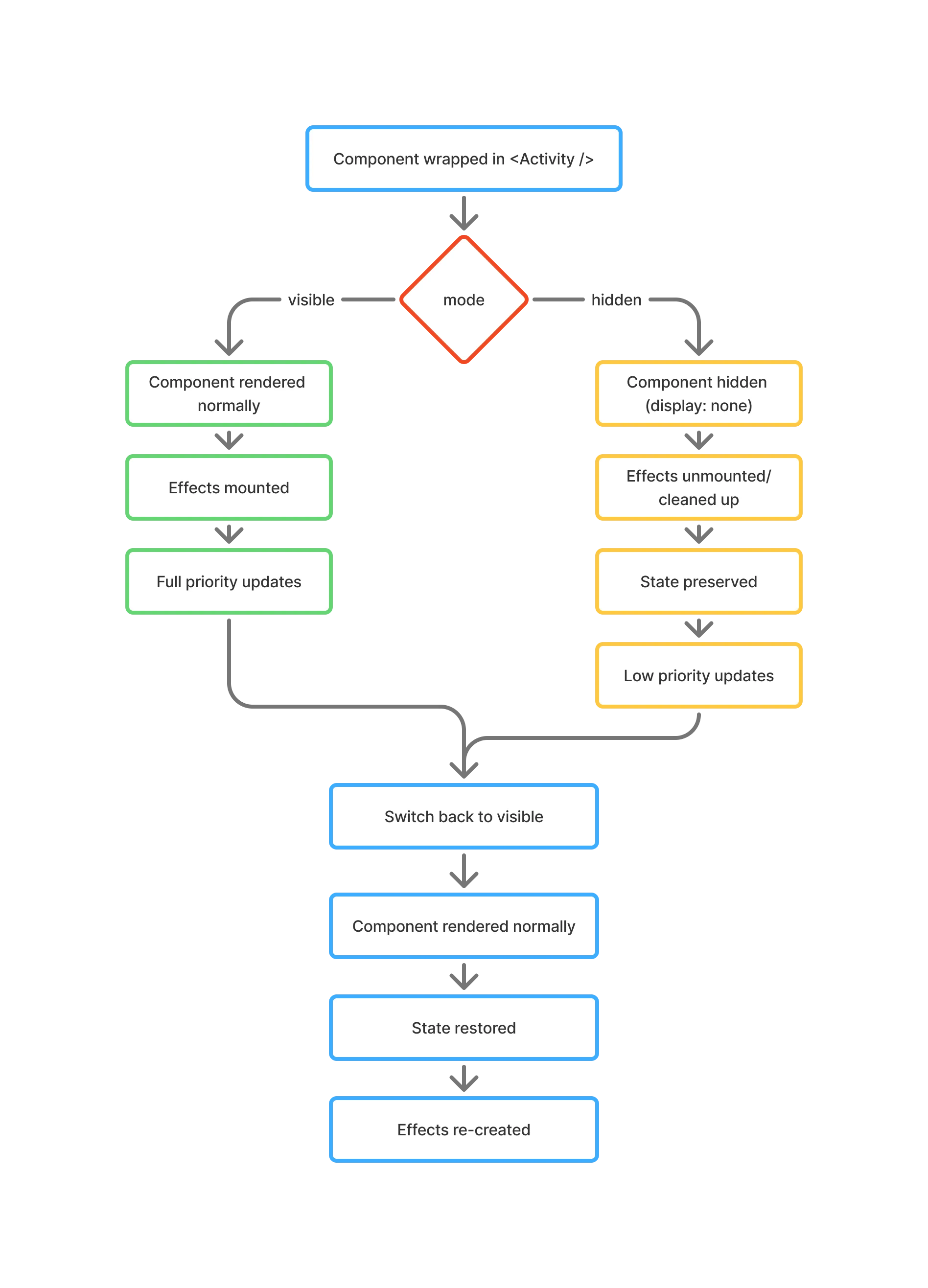
Lifecycle diagram showing how React’s Activity component manages component visibility, effects, and state preservation
Building a Simple Example Project
Let’s build a practical example to see Activity in action. We’ll create a tabbed interface where each tab contains a form, and we want to preserve user input when switching between tabs.
Step 1: Set Up Your React Project
Create a new Next.js project:
npx create-next-app@latestMake sure you’re using React 19.2 or later. If not, update your package.json:
{
	"dependencies": {
		"react": "^19.2.0",
		"react-dom": "^19.2.0"
	}
}
You can follow along with the tutorial’s GitHub repo here.
Step 2: Create the Tab Components
Let’s create three simple tab components. Start with a /Profile.tsx component:
import { useState, useEffect } from "react";

export default function Profile() {
	const [name, setName] = useState("");
	const [bio, setBio] = useState("");

	useEffect(() => {
		console.log("Profile effects mounted");

		// Simulate a subscription or API call
		const subscription = setInterval(() => {
			console.log("Profile effect running...");
		}, 2000);

		return () => {
			console.log("Profile effects cleaned up");
			clearInterval(subscription);
		};
	}, []);

	return (
		<div className="max-w-2xl mx-auto">
			<h2 className="mt-0 mb-6 text-gray-900 dark:text-white text-3xl font-semibold">
				Edit Profile
			</h2>
			<form className="flex flex-col gap-6">
				<label className="flex flex-col gap-2 font-medium text-gray-900 dark:text-gray-200 text-sm">
					Name:
					<input
						type="text"
						value={name}
						onChange={(e) => setName(e.target.value)}
						placeholder="Enter your name"
						className="px-3 py-3 border border-gray-300 dark:border-gray-600 rounded-md text-base font-normal bg-white dark:bg-gray-800 text-gray-900 dark:text-white focus:outline-none focus:border-indigo-600 dark:focus:border-indigo-400 focus:ring-2 focus:ring-indigo-100 dark:focus:ring-indigo-900 transition-all"
					/>
				</label>

				<label className="flex flex-col gap-2 font-medium text-gray-900 dark:text-gray-200 text-sm">
					Bio:
					<textarea
						value={bio}
						onChange={(e) => setBio(e.target.value)}
						placeholder="Tell us about yourself"
						rows={4}
						className="px-3 py-3 border border-gray-300 dark:border-gray-600 rounded-md text-base font-normal bg-white dark:bg-gray-800 text-gray-900 dark:text-white resize-y focus:outline-none focus:border-indigo-600 dark:focus:border-indigo-400 focus:ring-3 focus:ring-indigo-100 dark:focus:ring-indigo-900 transition-all"
					/>
				</label>
			</form>
			<p className="mt-8 p-4 bg-gray-100 dark:bg-gray-800 rounded-md text-gray-600 dark:text-gray-400 text-sm text-center">
				Try typing here, then switch tabs!
			</p>
		</div>
	);
}
What’s happening here? We have a simple form with controlled inputs. The useEffect hook simulates a background task (like a real-time sync or analytics) and cleans up properly when the component unmounts.
Create similar components for Home.tsx and Settings.tsx with their own forms:
import { useState, useEffect } from "react";

export default function Home() {
  const [search, setSearch] = useState("");
  const [filter, setFilter] = useState("all");

  useEffect(() => {
    console.log("Home effects mounted");

    // Simulate a subscription or API call
    const subscription = setInterval(() => {
      console.log("Home effect running...");
    }, 2000);

    return () => {
      console.log("Home effects cleaned up");
      clearInterval(subscription);
    };
  }, []);

  return (
    <div className="max-w-2xl mx-auto">
      <h2 className="mt-0 mb-6 text-gray-900 dark:text-white text-3xl font-semibold">
        Home
      </h2>
      <form className="flex flex-col gap-6">
        <label className="flex flex-col gap-2 font-medium text-gray-900 dark:text-gray-200 text-sm">
          Search:
          <input
            type="text"
            value={search}
            onChange={(e) => setSearch(e.target.value)}
            placeholder="Search..."
            className="px-3 py-3 border border-gray-300 dark:border-gray-600 rounded-md text-base font-normal bg-white dark:bg-gray-800 text-gray-900 dark:text-white focus:outline-none focus:border-indigo-600 dark:focus:border-indigo-400 focus:ring-2 focus:ring-indigo-100 dark:focus:ring-indigo-900 transition-all"
          />
        </label>

        <label className="flex flex-col gap-2 font-medium text-gray-900 dark:text-gray-200 text-sm">
          Filter:
          <select
            value={filter}
            onChange={(e) => setFilter(e.target.value)}
            className="px-3 py-3 border border-gray-300 dark:border-gray-600 rounded-md text-base font-normal bg-white dark:bg-gray-800 text-gray-900 dark:text-white focus:outline-none focus:border-indigo-600 dark:focus:border-indigo-400 focus:ring-2 focus:ring-indigo-100 dark:focus:ring-indigo-900 transition-all"
          >
            <option value="all">All</option>
            <option value="recent">Recent</option>
            <option value="popular">Popular</option>
          </select>
        </label>
      </form>
      <p className="mt-8 p-4 bg-gray-100 dark:bg-gray-800 rounded-md text-gray-600 dark:text-gray-400 text-sm text-center">
        Try typing here, then switch tabs!
      </p>
    </div>
  );
}
import { useState, useEffect } from "react";

export default function Settings() {
  const [theme, setTheme] = useState("light");
  const [notifications, setNotifications] = useState(true);

  useEffect(() => {
    console.log("Settings effects mounted");

    // Simulate a subscription or API call
    const subscription = setInterval(() => {
      console.log("Settings effect running...");
    }, 2000);

    return () => {
      console.log("Settings effects cleaned up");
      clearInterval(subscription);
    };
  }, []);

  return (
    <div className="max-w-2xl mx-auto">
      <h2 className="mt-0 mb-6 text-gray-900 dark:text-white text-3xl font-semibold">
        Settings
      </h2>
      <form className="flex flex-col gap-6">
        <label className="flex flex-col gap-2 font-medium text-gray-900 dark:text-gray-200 text-sm">
          Theme:
          <select
            value={theme}
            onChange={(e) => setTheme(e.target.value)}
            className="px-3 py-3 border border-gray-300 dark:border-gray-600 rounded-md text-base font-normal bg-white dark:bg-gray-800 text-gray-900 dark:text-white focus:outline-none focus:border-indigo-600 dark:focus:border-indigo-400 focus:ring-2 focus:ring-indigo-100 dark:focus:ring-indigo-900 transition-all"
          >
            <option value="light">Light</option>
            <option value="dark">Dark</option>
            <option value="auto">Auto</option>
          </select>
        </label>

        <label className="flex flex-row items-center gap-3 font-medium text-gray-900 dark:text-gray-200 text-sm">
          <input
            type="checkbox"
            checked={notifications}
            onChange={(e) => setNotifications(e.target.checked)}
            className="w-5 h-5 cursor-pointer accent-indigo-600 dark:accent-indigo-400"
          />
          Enable Notifications
        </label>
      </form>
      <p className="mt-8 p-4 bg-gray-100 dark:bg-gray-800 rounded-md text-gray-600 dark:text-gray-400 text-sm text-center">
        Try typing here, then switch tabs!
      </p>
    </div>
  );
}
Step 3: Compare Traditional vs Activity Approach
Let’s first see the traditional approach without Activity:
Replace app/page.tsx with:
// WITHOUT Activity - State is lost!
"use client";
import { useState } from "react";
import { Activity } from "react";
import Home from "@/components/Home";
import Profile from "@/components/Profile";
import Settings from "@/components/Settings";

export default function App() {
  const [activeTab, setActiveTab] = useState("home");

  return (
    <div className="max-w-3xl mx-auto p-8 min-h-screen">
      <nav className="flex gap-2 border-b-2 border-gray-200 dark:border-gray-700 mb-8 pb-0">
        <button
          className={`px-6 py-3 font-medium text-gray-600 dark:text-gray-400 transition-all duration-200 border-b-[3px] border-transparent -mb-[2px] ${
            activeTab === "home"
              ? "text-indigo-600 dark:text-indigo-400 border-indigo-600 dark:border-indigo-400"
              : "hover:text-gray-900 dark:hover:text-gray-200 hover:bg-gray-50 dark:hover:bg-gray-800"
          }`}
          onClick={() => setActiveTab("home")}
        >
          Home
        </button>
        <button
          className={`px-6 py-3 font-medium text-gray-600 dark:text-gray-400 transition-all duration-200 border-b-[3px] border-transparent -mb-[2px] ${
            activeTab === "profile"
              ? "text-indigo-600 dark:text-indigo-400 border-indigo-600 dark:border-indigo-400"
              : "hover:text-gray-900 dark:hover:text-gray-200 hover:bg-gray-50 dark:hover:bg-gray-800"
          }`}
          onClick={() => setActiveTab("profile")}
        >
          Profile
        </button>
        <button
          className={`px-6 py-3 font-medium text-gray-600 dark:text-gray-400 transition-all duration-200 border-b-[3px] border-transparent -mb-[2px] ${
            activeTab === "settings"
              ? "text-indigo-600 dark:text-indigo-400 border-indigo-600 dark:border-indigo-400"
              : "hover:text-gray-900 dark:hover:text-gray-200 hover:bg-gray-50 dark:hover:bg-gray-800"
          }`}
          onClick={() => setActiveTab("settings")}
        >
          Settings
        </button>
      </nav>

      <main className="py-4">
        <main>
          {activeTab === "home" && <Home />}
          {activeTab === "profile" && <Profile />}
          {activeTab === "settings" && <Settings />}
        </main>
      </main>
    </div>
  );
}
The problem: When you type into the Profile form and switch to another tab, all your input disappears when you come back. That’s because the component gets completely unmounted.
Now let’s use the Activity component:
// WITH Activity - State is preserved!
"use client";
import { useState } from "react";
import { Activity } from "react";
import Home from "@/components/Home";
import Profile from "@/components/Profile";
import Settings from "@/components/Settings";

export default function App() {
  const [activeTab, setActiveTab] = useState("home");

  return (
    <div className="max-w-3xl mx-auto p-8 min-h-screen">
      <nav className="flex gap-2 border-b-2 border-gray-200 dark:border-gray-700 mb-8 pb-0">
        <button
          className={`px-6 py-3 font-medium text-gray-600 dark:text-gray-400 transition-all duration-200 border-b-[3px] border-transparent -mb-[2px] ${
            activeTab === "home"
              ? "text-indigo-600 dark:text-indigo-400 border-indigo-600 dark:border-indigo-400"
              : "hover:text-gray-900 dark:hover:text-gray-200 hover:bg-gray-50 dark:hover:bg-gray-800"
          }`}
          onClick={() => setActiveTab("home")}
        >
          Home
        </button>
        <button
          className={`px-6 py-3 font-medium text-gray-600 dark:text-gray-400 transition-all duration-200 border-b-[3px] border-transparent -mb-[2px] ${
            activeTab === "profile"
              ? "text-indigo-600 dark:text-indigo-400 border-indigo-600 dark:border-indigo-400"
              : "hover:text-gray-900 dark:hover:text-gray-200 hover:bg-gray-50 dark:hover:bg-gray-800"
          }`}
          onClick={() => setActiveTab("profile")}
        >
          Profile
        </button>
        <button
          className={`px-6 py-3 font-medium text-gray-600 dark:text-gray-400 transition-all duration-200 border-b-[3px] border-transparent -mb-[2px] ${
            activeTab === "settings"
              ? "text-indigo-600 dark:text-indigo-400 border-indigo-600 dark:border-indigo-400"
              : "hover:text-gray-900 dark:hover:text-gray-200 hover:bg-gray-50 dark:hover:bg-gray-800"
          }`}
          onClick={() => setActiveTab("settings")}
        >
          Settings
        </button>
      </nav>

      <main className="py-4">
        <Activity mode={activeTab === "home" ? "visible" : "hidden"}>
          <Home />
        </Activity>

        <Activity mode={activeTab === "profile" ? "visible" : "hidden"}>
          <Profile />
        </Activity>

        <Activity mode={activeTab === "settings" ? "visible" : "hidden"}>
          <Settings />
        </Activity>
      </main>
    </div>
  );
}
The solution: Now when you type in the Profile form and switch tabs, your input stays there when you return. The component is hidden but not unmounted.
Step 4: Understanding the Props
The Activity component accepts two props:
children: The UI you want to show and hidemode: Either'visible'or'hidden'(defaults to'visible'if omitted)
That’s it. The API is intentionally simple and declarative.
Step 5: Observing Effect Behavior
Add this code to see how effects behave:
useEffect(() => {
	console.log("Tab mounted - effects running");

	return () => {
		console.log("Tab hidden - effects cleaned up");
	};
}, []);
What you’ll notice: When you switch tabs, you’ll see “Tab hidden - effects cleaned up” in the console. This proves that Activity properly unmounts effects even though it preserves state. Hidden tabs won’t do unnecessary background work.
Key Improvements and Benefits
The Activity component brings several improvements over older patterns:
1. Superior State Management
Activity preserves both React state and DOM state when components are hidden. This includes:
- Form input values in controlled components (
useState) - Uncontrolled form values (native DOM state)
- Scroll positions
- Focus states
- Animation states
2. Intelligent Effect Management
Unlike CSS hiding, Activity unmounts effects when hidden. This means:
- No unwanted background tasks consuming resources
- Proper cleanup of subscriptions and timers
- Accurate analytics (effects only run when components are truly visible)
- Better memory management
3. Pre-rendering and Performance
Activity enables pre-rendering of hidden content. When you set mode="hidden" during initial render, the component still renders (at low priority) and can load data, code, and images before the user even sees it. This cuts down loading times when users navigate to pre-rendered sections.
// Pre-render the Settings tab in the background
<Activity mode="hidden">
	<Settings /> {/* This loads data now, but shows later */}
</Activity>
4. Concurrent Updates and Priority
When hidden, Activity components continue to re-render in response to new props, but at a lower priority than visible content. Your hidden tabs stay up-to-date with data changes without slowing down the active UI.
5. Improved Hydration Performance
Activity boundaries participate in React’s Selective Hydration feature. This lets parts of your server-rendered app become interactive independently, so users can interact with buttons even while heavy components are still loading.
When Should You Use Activity?
Based on React’s documentation and community best practices, Activity works great for:
Perfect Use Cases:
1. Tabbed Interfaces When you have multiple tabs and want to preserve state when users switch between them.
2. Multi-Step Forms To maintain user progress as they navigate through form steps.
3. Modals and Sidebars When you want to preserve the state of hidden panels that users frequently open and close.
4. Navigation with Back Button Support To maintain scroll position and form state when users navigate away and return.
5. Pre-loading Future Content To prepare data, images, and code for sections users are likely to visit next.
When NOT to Use Activity:
Don’t use Activity when:
- You have simple show/hide logic with no state to preserve
- Components are truly one-time-use and won’t be revisited
- You want components completely removed from the DOM for memory reasons
- Components are extremely large and keeping them in memory would hurt performance
Advanced Pattern: Handling DOM Side Effects
Some DOM elements have side effects that persist even when hidden with display: none. The most common example is the <video> element, which continues playing audio even when hidden.
For these cases, add an effect with cleanup:
import { useRef, useLayoutEffect } from "react";

export default function VideoTab() {
	const videoRef = useRef();

	useLayoutEffect(() => {
		const video = videoRef.current;

		return () => {
			video.pause(); // Pause when Activity becomes hidden
		};
	}, []);

	return <video ref={videoRef} controls src="your-video.mp4" />;
}
Why useLayoutEffect? The cleanup is tied to the UI being visually hidden, and we want it to happen synchronously. The same pattern works for <audio> and <iframe> elements.
Summary: When and Why to Use Activity
The Activity component represents a fundamental shift in how React handles conditional rendering. Here’s when you should start using it:
Start using Activity when:
- You’re building tabbed interfaces, multi-step forms, or navigation-heavy apps
- State preservation matters to your user experience
- You want to pre-load content for faster navigation
- You need precise control over when effects run
Key takeaways:
- Activity preserves state like CSS hiding, but cleans up effects like unmounting
- It enables pre-rendering of hidden content for better performance
- Hidden components update at low priority without blocking visible UI
- It’s a first-class primitive built into React, not a workaround or hack
- The API is simple: just two props (
modeandchildren)
That’s pretty much it. The Activity component solves real problems that developers have been dealing with for years, and it’s available now in React 19.2. Give it a try in your next project. Your users will appreciate the improved experience, and your code will be cleaner and more maintainable.
Tags:
Related Posts
Design Systems 101: A Beginner's Guide to Building Consistency from Scratch
Learn how to build a design system from scratch and create consistent, professional interfaces. This beginner-friendly guide covers everything from color palettes and typography to components and documentation.
Complete TanStack Router Tutorial: Building a Todo App
Learn TanStack Router from scratch by building a complete Todo application. This comprehensive tutorial covers type-safe routing, data loading, mutations, navigation patterns, and error handling with practical examples.